Tailwind CSS Image Gallery
Build beautiful and responsive image galleries using Tailwind CSS grid and flex utilities. Perfect for showcasing photos, products, or portfolios with elegant layouts and smooth interactions.
Image galleries can be implemented in various ways, including grid layouts, carousels, or slideshows, depending on the design and user experience goals.
See below our simple Gallery examples styled with Tailwind CSS that you can use in your development projects.
Gallery Demo
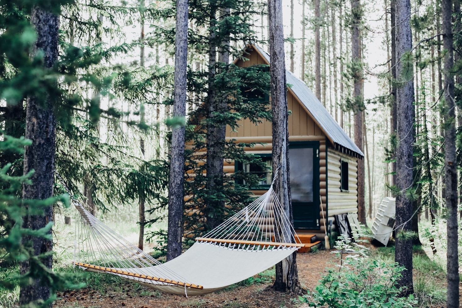
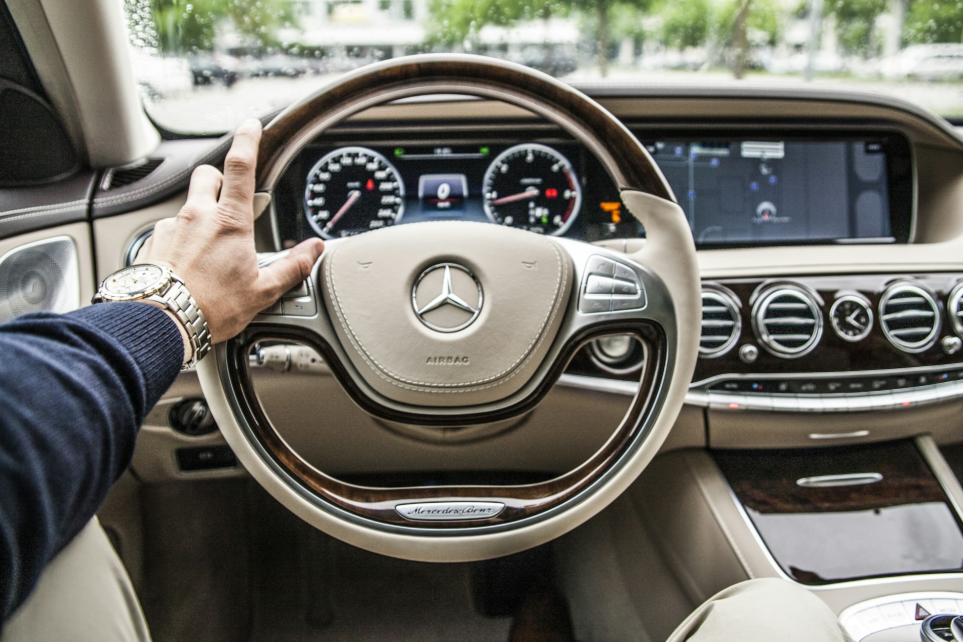
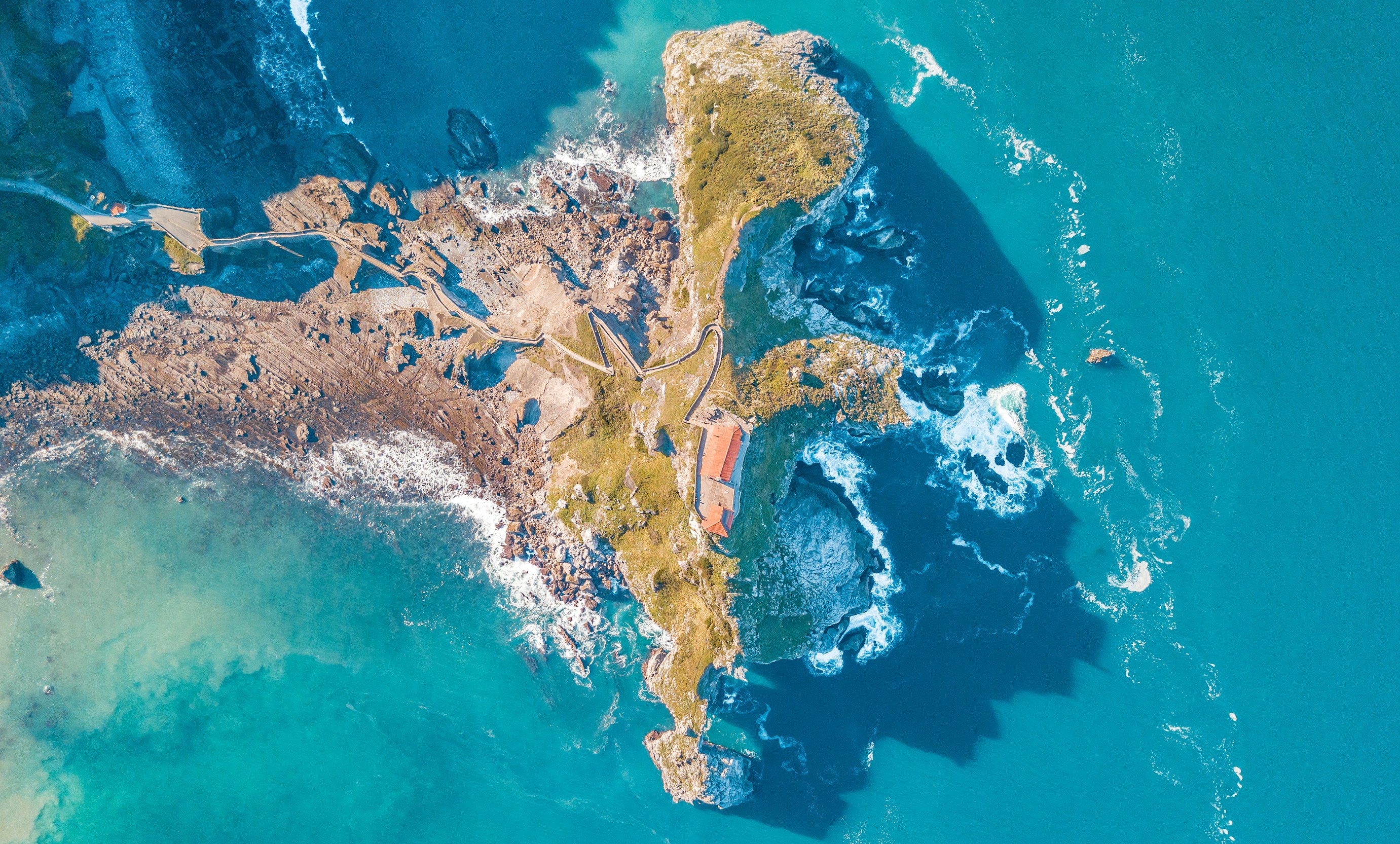
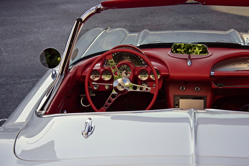
Create clean and responsive image grids using Tailwind CSS grid utilities. This example shows how to build a beautiful gallery that adapts from single to multiple columns while maintaining perfect image proportions with object-cover.
All images are styled to have the same width and height, creating a uniform look across the gallery. The object-cover CSS class ensures that images fill their designated space without distorting their aspect ratios, cropping as necessary.


Masonry Grid Gallery
Build dynamic masonry layouts using Tailwind CSS grid utilities. Create visually interesting galleries with varied image sizes and nested grids that maintain proper spacing and alignment.


The nested grid approach adds a layer of visual hierarchy, making the gallery more interesting and dynamic compared to a simple flat grid. It allows for grouping images in a way that can tell a story or highlight certain aspects of a collection.
Featured Image Gallery
Design product galleries using Tailwind CSS flex and aspect utilities. Combine a large featured image with smaller thumbnails for an engaging product showcase or portfolio display.
Quad Gallery
Create responsive quad layouts using Tailwind CSS grid and overflow utilities. Build horizontal scrollable galleries on mobile that expand into beautiful grid layouts on larger screens, using object-cover and rounded-lg for consistent image display.
Each image is wrapped in its own div and styled with classes to ensure they are displayed effectively:
object-cover object-center ensures the image covers its container without distorting the aspect ratio, with the focus on the center of the image.
h-40 max-w-full rounded-lg sets a fixed height of 40 units for the images, ensures they don't exceed the width of their container, and applies rounded corners.
md:h-60 increases the height of the images to 60 units on medium screens and larger, offering a responsive design that adapts to different screen sizes.
Gallery With Tab
Build categorized galleries using Tailwind CSS tab utilities. Organize images into tabbed sections for easy navigation and content organization, perfect for showcasing different image collections.
Required Script
Add these scripts to the bottom of your HTML:
1<script src="https://unpkg.com/@material-tailwind/[email protected]/dist/material-tailwind.umd.min.js" defer></script>