Figma Select - Material Tailwind
A select component, also known as a dropdown or select box, is a user interface component that allows users to choose a single option from a list of predefined choices. Typically presented as a closed menu, clicking or tapping on the select box reveals a list of available options. Users can then make their selection, and the chosen option is displayed when the menu is closed.
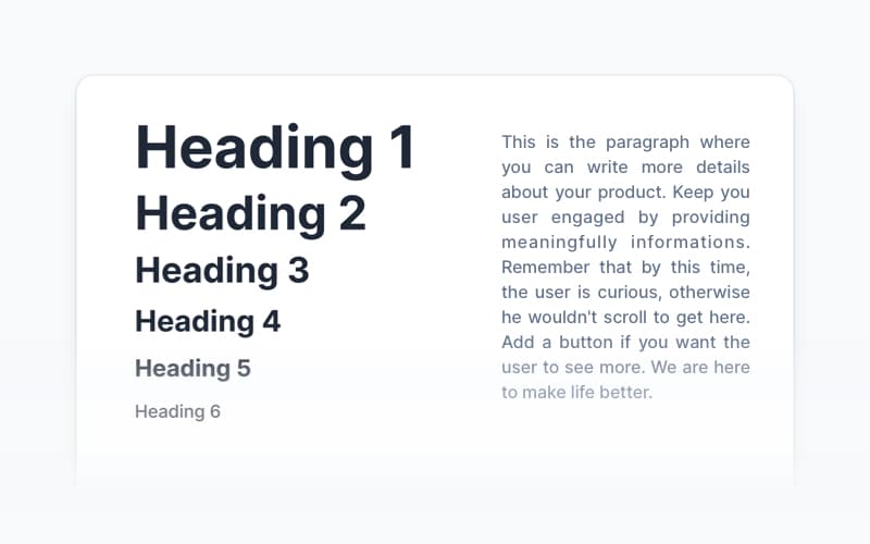
Foundations
Discover the foundational principles and concepts that power our design system. Master the core elements before moving on to more complex components and blocks.
Marketing & Presentation Blocks
Create visually engaging landing pages and marketing websites with these blocks, optimized to showcase products, services, and presentations effectively.
Content UI Blocks
Perfect for organizing and presenting information effectively, use these blocks to create engaging and user-friendly content-driven designs.
Ecommerce UI Blocks
Streamline the design of online stores and product showcases with blocks built to highlight products and services, ideal for landing pages and ecommerce sites.
Applications & Admin UI Blocks
Design intuitive and professional dashboards, admin interfaces, and web applications with fully customizable blocks for streamlined user management.
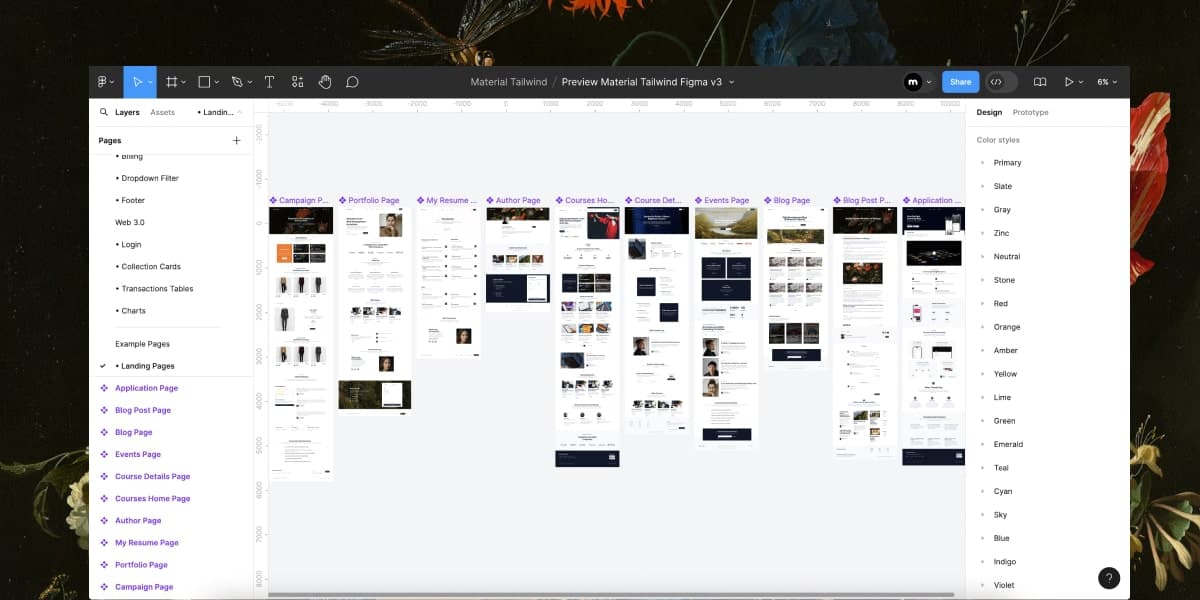
10 High-Converting Landing Pages
Get a head start with these pixel-perfect landing pages, designed for marketing campaigns and business goals.
